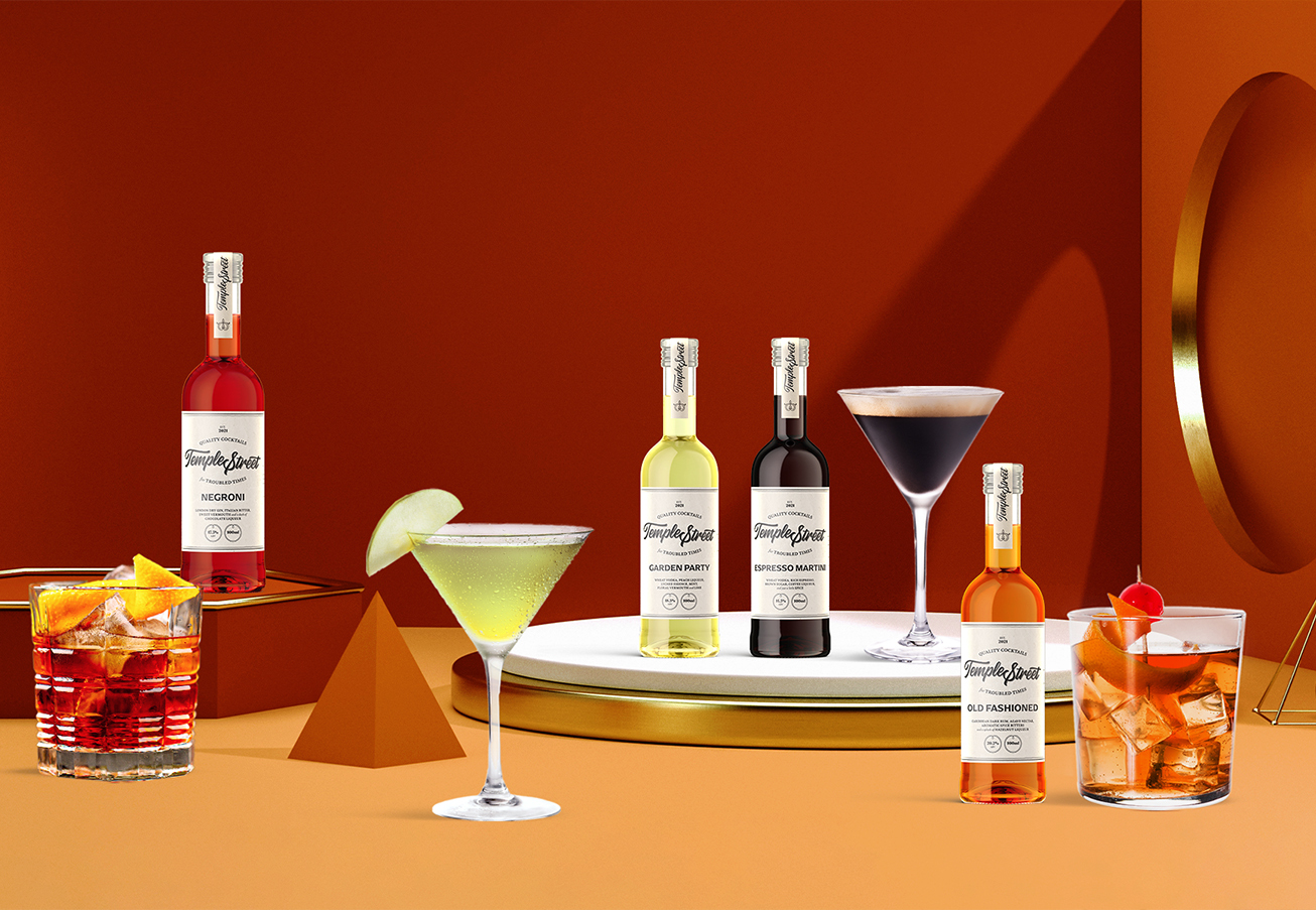
Ready-to-pour cocktail brand Temple Street recently launched in Singapore, and Team Mutant has been instrumental in bringing the brand to life. From design to PR, we worked hard to ensure that Temple Street was a success.
In terms of design, we were tasked with creating the look and feel of the brand, as well as curating a strong brand identity and language. The brief asked us to emphasise the brand’s authenticity while maintaining an aesthetic that balances modernity with maturity.
So, how did we do this? The answer: a robust visual design language.
It started with a name
The name Temple Street’s is inspired by Singapore’s Chinatown – a cultural melting pot that brings to mind an incredible fusion of old meets new.. This related well to Temple Street’s Range of ready-to-drink bottled cocktails which are a contemporary twist on old school classics. Now that we have a standout name, the next step was to ensure that the brand’s visual identity conveyed its values while deeply resonating with people. Sounding(and tasting) delicious is only the start.
Defining a design vision
Temple Street’s brand message was clear – old meets new, modernity meets maturity. To capture this feeling, we travelled back a hundred years ago to the iconic Prohibition era, a time when many classic cocktails spawned and remain today as favourites on bar menus.
Touches of this era’s influence are reflected in both the brand and packaging design; the labels for each variety of cocktails feature a deliberate use of textured typography and formal lettering set on a muted card stock, all serving as design cues that evoke nostalgia and drive home brand authenticity. This approach also spoke to the quality of the drink inside, and showcased Temple Street’s image as a celebration of its strong heritage.
Leveraging the element of surprise
While Temple Street draws inspiration from tradition and heritage, it also needed to exhibit a youthful vigour that is synonymous with cocktails and fun. To do this, we needed to emphasise Temple Street’s values of innovation and creativity.
Our strategy in treading the fine line between an old-school vibe and a modern aesthetic was to introduce an exuberant product photography direction – a playful element that preserves the brand’s innovative spirit.
The resulting creative convergence of a vintage label design juxtaposed against a backdrop of minimal, abstract podiums proved to be a striking formula. . We now have on our hands a brand identity that intricately weaves together localisation, tradition and innovation, making Temple Street a product that demands to be seen.

Design is powerful
Matching Temple Street’s brand values with intuitive art direction is one example of how branding is used to shape and impact perceptions. Good design has the power to grab attention, evoke the right emotions and create an air of excitement for a new product. When it comes to retail products, it’s all about getting your product to stand out when placed on a cluttered shelf.
Showcase your brand’s story
What makes a good brand? It always starts with a story that lives on through relentless branding that consistently inspires, influences and compels. Every brand has a unique story to tell, and when done right, design can be a powerful tool to showcase what makes you special to the masses and draw them towards your brand.
Need to design a brand from scratch? You’ve come to the right place: hello@mutant.com.sg

