
Storytelling is something so intrinsic to human beings that its evolution has followed that of our own. Oral storytelling traditions and hieroglyphics eventually turned into printed books and moving pictures. Today, storytelling’s largest medium is digital, allowing us to access pictures and words from around the world with a touch of a button. What a time to be alive!
But human beings have evolved, too. When it comes to consuming content, studies show that human attention spans are dropping. At the same time, Netflix binging is on the rise. If I had to hazard a guess, storytelling probably has something to do with that—and not just storytelling, but visual storytelling.
Achieving total recall
According to research, the human brain processes visual content 60,000 times faster than text. As a result, 90% of information transmitted to the brain is visual, which means we observe, learn, process and decide using visual information. We see this play out every day in digital formats, particularly on social media where compelling images can help your content average 94% more views.
But visuals alone fall short of the full storytelling experience. In fact, a combination of written and visual presentation formats are often the best for active learning and recall. With the variety of digital formats on offer, achieving this combination has never been easier.
To illustrate, check out these real-life examples that use both copy and visuals to elevate the storytelling experience:
- Social media photojournalism
Platforms like Instagram are elevating photojournalism to become more engaging than ever before. Take for example People’s Archive of Rural India (PARI), a media outlet that highlights important social issues by documenting everyday life in rural India. It addresses these sensitive and often overlooked issues by using photos from the field and interspersing them with striking copy. The images help magnify the humanity of its subjects to the reader, while the limited space for text necessitates carefully chosen copy. As a result, the story is distilled to its most impactful form and is more likely to leave a lasting impression.
This format is also ideal to break down complex subjects into bite-sized information, as we’ve experienced working with one of our social media clients, Binance Charity Foundation (BCF). As the charity arm of Binance, the world’s largest cryptocurrency exchange, BCF often has to simplify technical cryptocurrency terms to make its content accessible to different audiences. This post on NFTs is one such example of how images and succinct copy can condense a broad topic in a compelling way.
2. Interactive storytelling

The New York Times has been championing interactive visual formats that add an exciting experiential element to what would otherwise have been static stories. Take for example, its exploration of a classical artwork by famed Indian artist Chitaraman. The dynamic format zooms in and out of the painting, taking the reader on a digital art tour that is as illuminating as it is engaging.
Another example was its interactive visual op-ed story that helped readers find their place in the COVID-19 vaccination line. Here the Times went a step further by asking for the reader’s participation before telling an impactful story through a clever infographic. Talk about being memorable!
3. Engaging infographics and visual-led reports

Some forms of content require longer formats, such as whitepapers or business reports. In these cases, visuals play an important role in not only adding a refreshing differentiation between sections of text, but also bringing data and impactful words to life.
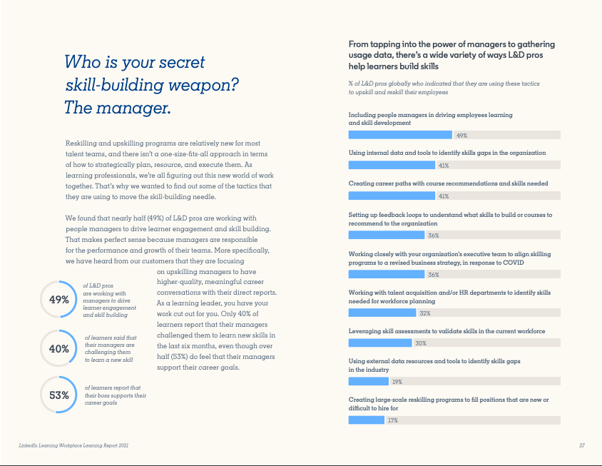
LinkedIn, for example, publishes a number of data-led reports that consistently and generously make use of visual elements. Their 2021 Workplace Learning Report featured a combination of graphs, pull out quotes and vibrant visuals to create a report that was heavy on insights but light on the eyes.
Some reports go a step further with an almost entirely infographic format, such as the 2021 Quarterly Job Market Index reports we worked on for our client RGF International Recruitment. The report series was almost entirely visually led, accompanied by a short commentary on each page. Aside from being engaging, formats like this offer quick takeaways that help both layman and media audiences easily navigate the report’s key insights.
These examples show that hybrid visual and copy formats can be as complex or as simple as you need or your capabilities allow. But regardless of visual elements, it is important to remember that to get results, the basics of content strategy will always apply. This means always considering your audience, determining your objectives, and staying authentic to your brand voice. Once you’ve got this covered, let your visuals do the rest.
Need some fresh content or visuals to tell your story? We can help! Write to us at hello@mutant.com.sg