Have you ever walked into a room of professionals speaking passionately and concisely about a subject, only to find that you have zero clue about the discussion?
As a creative who works closely with PR consultants and associates, I can only imagine that this is exactly how my colleagues (and even clients) feel whenever the creative team explains their rationale and decisions behind a design project.
Here are 5 design terms you can use the next time you communicate an idea with your designers:
White space
Also known as breathing space or negative space. To put it in its simplest form, white space is the area between design elements. Unlike its namesake, white space doesn’t have to be “white”; it is essentially a space between text blocks (more on that below), images, and around the printed pages. Any background, colour, or texture that doesn’t draw attention away from the subject matter can be white space.

(image credit: Indesign Skills)
When to ask for white space:
White space should be generously applied on every artwork. When something feels “cluttered” or too busy, consider asking for more white space.
Visual hierarchy
It’s the arrangement of design elements according to priority or reading order. The ultimate goal of every artwork is to achieve clear visual hierarchy, sacrificing as little visual interest as possible.
Good visual hierarchy leads the eye to read a piece of work in order, whereas bad visual hierarchy leaves the reader confused and unsure of where to start. It’s important to note that size, positioning, typography and colour choices affect the hierarchy of an artwork, so the next time you think something “needs to be bigger”, remember that what you really mean is that you want it to be more “prominent”.

(image credit: Reddit)
When to ask for visual hierarchy:
Do you feel lost when you look at a piece of artwork? Is the page number fighting for attention with the body text of a book? Are the images overshadowing vital statistics on your website? These are perfect opportunities to review the visual hierarchy with your creative team. Sometimes, it’s a matter of sitting down with them to list out which element needs to be the centrepiece, which element should follow, and so on.
With that said, keep in mind that if everything needs to be prominent, nothing is really prominent! Be honest with yourself and the designers.
Leading (pronounced as LED-ing)
Leading is the vertical “white space” between lines of text. If you’re more immersed in the UI/UX world, you may be familiar with the term “line-height” instead, and they’re essentially the same thing. Generous leading makes reading pleasant, whereas narrow leading should only be used for a specific stylistic reason.
Good leading can be the differentiating factor between good and bad design. . These are often the “invisible” tweaks a designer would make to instantly improve an artwork. There aren’t a lot of things that are instant in design, but this is definitely one of them.

(image credit: Patricia Gomez)
When to ask for leading:
When the text feels “cramped” even when there is a generous amount of white space. The leading needs to be increased when lowercase letters like g’s and uppercase letters like d’s touch each other, and decreased when it is so wide that another line of text could fit in between them.
Kerning and tracking
Despite being used interchangeably, tracking and kerning are 2 different things.
Kerning is the localised space adjustment between 2 letters. Some typefaces require more kerning than others, but in general, spaces between right-angled letters (H, I, L, T) and rounded or acute-angled letters (O, Y, A, V) are more problematic. Bad kerning can cause you a lot of money and impact your brand, especially if you have a billboard or web banner where millions of people misread what you sell.
On the other hand, tracking refers to the general spacing between letters in a text block. It can be pushed to extremes for stylistic purposes such as ZARA’s new logo and Christopher Nolan’s movie titles, but when it comes to body copy and by-lines, tracking should be generous without blurring the lines between words and tight enough without causing the letters to overlap.

(image credit: Icon8)

(image credit: Gravit Designer)
When to ask for kerning & tracking:
When your text looks l i k e t h i s and it’s not supposed to, ask for tighter tracking.
When your text is uncomfortable to read or worse, letters are touching each other, ask for wider tracking.
Kerning is a little difficult to spot when you’re not a designer, so this is where you’ll have to trust that they’re doing their job correctly!
For print and for screen
Screen designs and print designs are almost 2 entirely different things behind the scenes (or screens). What do we mean by that? Here are some key differences between print and screen designs:
Colour mode

(image credit: Gogoprint)
Print designs are printed in CMYK format, which is “duller” by nature and screen designs are displayed in RGB format, which is literally brighter than its print counterpart thanks to LEDs in our screens. Some neon bright colors may look good on screen, but when the same artwork is printed without the aid of special inks, it will completely lose its lustre.
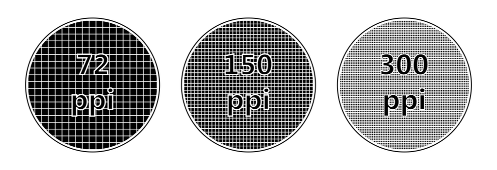
This is the main culprit behind sluggish computers. Print designs are generally prepared at 300ppi, while screen designs operate at 72ppi. This means that a 1000 x 1000 IG poster designed for screen at 72ppi will look extremely blurry when printed on the front cover of a magazine. This is why “high-resolution” photos are often sufficient for screen designs but inadequate for print designs. Now if that’s all too complicated for you, just tell your designers whether the design needs to be printed or not!
When to indicate whether a design will be for print or for screen:
During the briefing stage – before the design process begins.
In summary, design is as technical as it is artistic. Creatives use jargons to convey a number of information concisely, just as every other profession does. We hope these terms help you to better communicate with your designers—because it will definitely help them design better.
Want to partner up with an award-winning agency that communicates well inside-out? Email us at hello@mutant.com.sg!