When Chinese tech giant Xiaomi unveiled its new logo ahead of April’s Fool, there was a LOT of chatter (and memes). Created by internationally acclaimed designer Kenya Hara, the new logo is part of its refreshed corporate identity, with the design concept of “Alive”. It took three years and over US$300,000 to create. The result? A superellipse – also known as a Lamé curve, which features mathematically rounded corners – and a redesigned ‘MI’ typography. Which ultimately means that it went from a square to a… squircle?
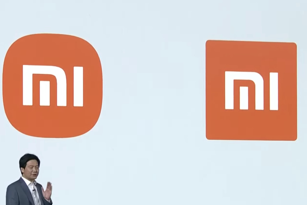
Unsurprisingly, many were unimpressed. As the face of Xiaomi’s prowess, the new logo drop felt underwhelming. However, there’s more to it than just rounded corners. Regardless of how you feel about it, one thing’s for sure: most people are missing the point. When we see past the marketing of it all, the new logo is not the rebrand – it just signals an exciting shift in Xiaomi’s future design directions.
This is because rebranding isn’t as straightforward an endeavour as it may seem. It’s a huge challenge – and more often than not, it’s easy to miss the mark. A brand is more than a logo. More importantly, a rebrand should be evidenced by a meaningful and enhanced brand experience, not just a visual change. So if your rebranding exercise begins and ends with making the logo pop,then I’ve got some bad news for you – you’re not looking for a rebrand, you’re just looking for a new logo.
But before you brief your design team or commission a designer for your logo refresh, there are a few things you should consider.
If it ain’t broke, don’t fix it
While the logo is synonymous with your brand, it’s important to take a step back and recognise that it’s only one of the many facets of your brand and ask yourself why you think you should redesign yours. After all, a pretty logo can’t salvage a weak brand reputation, or a disorganised business. So consider whether the logo refresh is really what needs fixing – and if not, then leave the logo as is.
Bigger isn’t always better
But if you are looking for a refreshed logo because it no longer aligns with your brand identity, consider how your business has grown over years. Logos need to stand out, sure, but have you noticed that as brands grow more recognisable, there’s less need to make the logo pop? That’s because there is power in quiet confidence – when you let consumers make their own associations, it is far more compelling than forcing the recognition.
Rebranding is a holistic change
But if a rebrand is really what you’re after – an entire change to the corporate identity, not just the logo – then before embarking on this exciting venture, it’s vital to realise that this process is an arduous journey that costs not only time, but money as well.
Luckily, rebranding comes in all shapes and sizes. Your brand might just need a visual revamp – a simple logo refresh, an update to the colour palette, new marketing materials that align with the updated corporate vision or goals. Even if it might not need a total 180, you first must determine the purpose of your rebranding. To do this, consider the stability of your structure, and how the rebrand will affect it.
Three reasons to rebrand
To help you decide if your brand warrants a revamp, let’s consider a few potential factors.
- Repositioning the business
If you find your brand messaging is getting stale, consider a rebrand to become more appealing and attract new audiences.
In 2008, the e-commerce behemoth Walmart hit a rough patch and realised its slogan “Always low prices” didn’t work anymore. The messaging went awry – people started associating rock bottom prices with low-quality products and services. It was in need of an identity overhaul. As a result, their new tagline “Save Money. Live Better.” tweaked the narrative to communicate that its low prices actually improve lives, and the company also rolled out a new logo that radiated excitement and stores that were redesigned with a fresh colour palette. The campaign turned out to be a massive success. - Modernising the business
When Mastercard updated their brand mark by removing the stripes in the overlapping portion of the circles, it had been 20 years since the last change. (See above: if it ain’t broke, don’t fix it.) But changes in the market began threatening the company’s identity – with the rise of digital banking, the brand needed a reinvention that communicated modernity and simplicity. Mastercard’s new identity was better optimised for smaller screens, and helped transition the company into the digital age successfully. - Merging more than one business
An immediate rebrand is warranted when companies merge and cultures collide. The challenge begins internally – to tackle disjointed entities, a rebrand is necessary to form a cohesive brand message that captures the best of both legacies.
Take a page from Candid, the merger between Foundation Center and GuideStar, two of the biggest non-profit, information-sharing forces. The website features a sleek design with a mission statement, guiding principles, and a vision that communicates the best of both companies.
Once you’ve pinpointed and validated the reason(s) behind your visual refresh or complete rebrand, you’ll be prepared to finally send the brief to your design team or get that designer you’ve long-admired on a call.
Once the designs are approved, there is also a list of things to consider prior to launching your sparkling new brand successfully. You need the right team to coordinate the rollout plan, prepare press releases, create timelines, prep assets and collateral, assign point people…you get the point. But considering the time and effort you put into your rebrand, it’s important that it’s launched successfully so that your shareholders and customers understand the company’s point of view and see the vision as it comes to life.
Are you ready to make the switch from a logo design to a complete branding? We can help: hello@mutant.com.sg